

As one of the three pillars of observability, along with logs and traces, digesting metrics is a crucial part of any ITOps admins’ job. Metrics are a numeric representation of data measured over intervals of time and thus can derive knowledge of system behavior historically, which can help predict future patterns of behavior and inform investigations of issues and incidents.
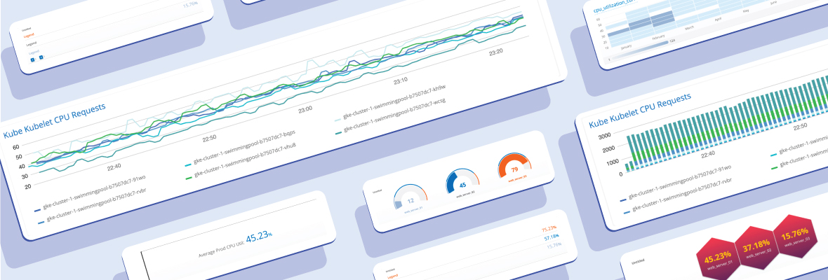
Once monitoring tools have collected metrics, the next step in creating actionable insights is to visualize them in a dashboard. In this blog, I’ll go into some tips for what types of dashboards to create for what types of metrics. The purpose of creating great-looking dashboards is to easily identify anomalies so team members can take action faster; choosing the right charts makes this more streamlined. Here at OpsRamp, we’re standardizing on the use of the open-source query language, Prometheus, for dashboard creation.
Short primer on Prometheus (PromQL)
PromQL is rapidly growing in popularity in the DevOps space and is becoming the norm for monitoring containers and microservices because it allows flexible manipulation of time series data. The Prometheus client libraries offer four core metric types. Each chart better suits specific types of these metrics.
The four PromQL metric types are as follows:
- Counter: a cumulative metric that represents a single monotonically increasing counter whose value can only increase or be reset to zero on restart;
- Gauge: a metric that represents a single numerical value that can arbitrarily go up and down (CPU utilization etc);
- Histogram: samples observations and counts them in configurable buckets; can also provide a sum of all observed values;
- Summary: samples observations and provides a total count of observations and a sum of all observed values; configurable quantiles are calculated over a sliding time window.
Common charts types for observability
It’s important to select the right chart for the right audience. CXOs need high level information compared with IT admins and DevOps folk who need to identify anomalies and troubleshoot issues quickly. Here are some of the most-used charts and which metrics to collect for each one.
Time Series Tile
As defined by OpsRamp, the time series tile, or widget, displays data points at successive time intervals. Each point on the graph corresponds to a specific point in time and a metric value that is being measured. Data points can be viewed in the form of a connected line chart or a vertical bar chart.
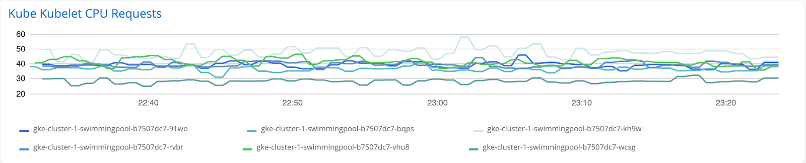
Line Chart
Line charts are recommended for tracking changes in metric values over periods of time. They provide an easy, scannable way to view and compare the values of multiple hosts or resources in a singular graph.
Recommended metrics: Gauge metrics, e.g. CPU, Memory, Disk, Availability
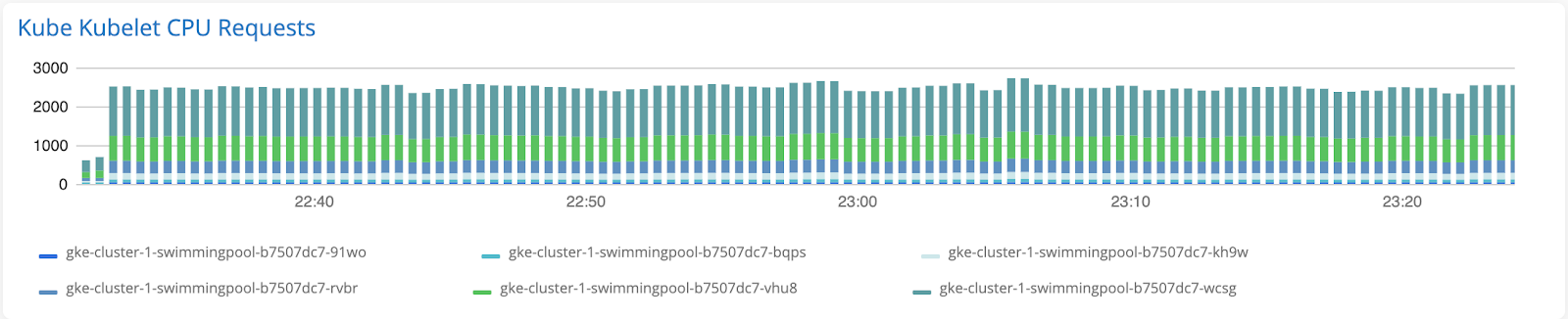
Bar Chart
Bar charts are recommended for comparing the metric values of different hosts or resources over time. Each host or resource will be represented as a stack on the bar chart. We recommend using bar charts in tandem with the line charts (combo chart), wherein the bar chart represents metric values of each resource, and the line chart depicts an aggregation of these values (e.g. the average value of all resources).
Recommended metrics: Gauge metrics, e.g. CPU, Memory, Disk, Availability or Histogram metrics
Single Value Tile
The single value tile displays a single data point at a specific point in time. If the query returns more than one series, an aggregation of the metric must be taken to consolidate the values into a singular unit. We recommend using the single value tile to summarize important time series data or provide a high-level overview of your IT infrastructure at a glance. Some examples may include the count of specific resource types or tracking extreme values of availability metrics.
Recommended metrics: Counter metrics or aggregations of any metric (e.g. Count, Sum, Average, Min, Max)

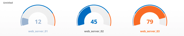
Gauge Tile
The gauge tile provides a single value at a specific point in time for each series in the query. Each gauge will have an accompanying visual that shows the value of the metric relative to a certain scale, in most cases from 0-100%. Threshold values can be set to change the color of the chart when metrics reach a certain value.
Recommended metrics: Gauge metrics, e.g. CPU, memory, disk
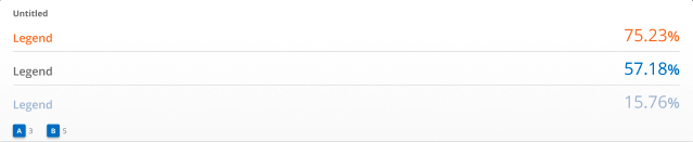
List Tile
The list tile displays a single metric value for each series that is returned by the query. Lists are commonly used with the topk or bottomk operator in PromQL to return the most extreme metric values of the query.
Recommended metrics: Gauge metrics, e.g. CPU, memory, disk
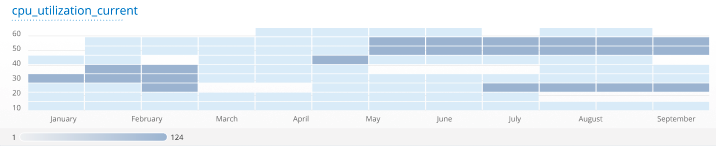
Heatmap Tile
The heatmap tile provides a graphical representation of data that uses a system of color-coding to represent the number of hosts, resources and applications that share similar metric values over time. Each rectangle on the heatmap represents a range of metric values at a specific time. The density of the rectangle indicates the count of hosts or resources that have metric values within a particular range (y-axis) at a particular time (x-axis). Heatmaps are useful for displaying group trends and spotting outliers. For this reason, we recommend using the heatmap tile when viewing metrics that have a wide distribution of values.
Recommended metrics: Gauge or Histogram based metrics, e.g. availability, utilization, or capacity metrics
Honeycomb Tile
Honeycomb charts have grown in popularity tremendously in the DevOps world. This tile delivers a big picture view of your IT infrastructure, while still providing significant detail. Honeycomb charts are composed of individual hexagons, each of which represents a specific host or resource. These hexagons can be grouped together based on a tag/attribute to provide a logical organization of chart elements. Each hexagon also reflects the corresponding metric value by changing colors when the defined thresholds are reached. Honeycomb charts can incorporate an additional metric as well by sizing each hexagon differently based on the value of that metric.
Recommended metrics: Gauge, Histogram, or Counter metrics

Closing Tips
Once you’ve selected the best visualization option for your tiles, there are a few more things to keep in mind to ensure your dashboard can really drive key insights. The goal is to gain an understanding of your IT infrastructure at a glance, so this is where things such as organization and design come into play.
- Tile Position/Ordering: Each tile on your dashboard should be placed in a logical order, usually having important high-level stats near the top and progressively moving to the deeper, more granular metrics as you move to the bottom of your dashboard. Stakeholders will be able to understand the performance of your systems without spending too much time going into detail.
- Design (Color Scheme/theme): Although the metrics may be the meat and potatoes of the dashboard, design plays an important role as well. Selecting an aesthetically pleasing color palette and theme helps consumers of your dashboard easily digest the data and understand it too.
Next Steps:
- 5 Tips for Observability Success
- The New Metrics for IT Operations
- Use PromQL and OpsRamp to Define Killer SLOs